
Modelling Obesity with Decision Trees (PY)
My last post was a bit lengthy so I will try to keep things short and (hopefully) simple. In this post we will use the GFSI data to perform a decision tree regression. The goal is to verify which variables are the most important in determining the countries with the highest obesity prevalence. This is the first time I use any ML algorithm in Python, so let’s see what happens!
Part 1: Preparing our data and performing the tree regression
Decision tree regressions allow us to use decision trees to model numeric data. According to Langtz (2013):
“decision tree learners build a model in the form of a tree structure. The model itself comprises a series of logical decisions, similar to a flowchart, with decision nodes that indicate a decision to be made on an attribute. These split into branches that indicate the decision’s choices.”
For a more illustrative and simple application of a decision tree regression, visit this excellent post. I am still a novice when it comes to using Machine Learning algorithms. However, I find it much easier to perform the models and then interpret the output. Let’s start!
#first we will load our GFSI database:
import pandas as pd
d1 = pd.read_csv("gsfi_logit.csv")

#for this model we do not need the country variable so we can drop it
#we specify the axis to say that it's a column and not a row:
d1 = d1.drop('country', axis=1)

#let's confirm if it worked:
d1.head()
| obesity | PPC | KCAL | div | poverty | consumption | popdens | OECD | |
|---|---|---|---|---|---|---|---|---|
| 0 | 23.50 | 13760.92 | 3229.40 | 42.00 | 7.72 | 43.09 | 16.43 | 0 |
| 1 | 9.10 | 7340.70 | 2200.80 | 39.20 | 54.52 | 50.45 | 21.61 | 0 |
| 2 | 24.70 | 21893.08 | 3017.40 | 66.00 | 3.63 | 33.17 | 15.70 | 0 |
| 3 | 27.00 | 44167.94 | 3255.80 | 74.80 | 0.00 | 10.05 | 3.06 | 1 |
| 4 | 17.40 | 45358.62 | 3797.40 | 73.00 | 0.00 | 9.94 | 103.76 | 1 |
Now that we removed this column, we have to create two subsets for our tree regression. We will call “x” the subset which contains all of the regressors. Thus, “y” will be obesity prevalence, which is the variable we are trying to model. Then, we will import the decision tree regressor from scikit-learn:
#creating the x subset:
x = d1.drop('obesity', axis=1)
y = d1['obesity']

#now we import the corresponding function
#make sure to have sci-kit installed before doing so:
from sklearn.tree import DecisionTreeRegressor

#create a regressor object with default settings:
regressor = DecisionTreeRegressor(random_state = 0)

# fit the regressor with the x and y data:
model = regressor.fit(x, y)
Part 2: Interpeting the model output
So far, we have generated an object called “model” from our decision tree regression. We must remember that we are not using this model to generate predictions. We simply want to make a decision tree and see how this ML algorithm classifies our regressors. Before doing so, we can inspect some of the attributes our model has. The simplest way is to type model?. This will generate a long description of the features and attributes of this model. For now we will focus on two attributes:
#first we check the number of features in our model:
model.max_features_
7
This matches to the seven regressors we used in our subset “x”. Next we will call for the most important features of this model:
model.feature_importances_
array([0.58775826, 0.1246276 , 0.07449675, 0.068188  , 0.02930249,
       0.06683283, 0.04879407])
The higher the value in the array, the more important the feature. If we recall the order of our features, the tree regression places the most importance on the GDP per capita variable, followed by KCAL and div. This is a similar result to what we obtained in the previous post. The least important variable seemes to be the average household expenditure on food consumption.
Part 3: Visualizing our tree
We just performed a simple exploration of the decision tree regression model. In general terms, the model has classified each regressor by the Mean Square Error criteria. We have seen that GDP per capita is the most important regressor we have for modelling obesity prevalence. Now we can visualize our results by generating a decision tree with our output. This is a slightly complicated procedure but let’s start with the Python syntax:
#first we will import the library we want from sklearn:
from sklearn.tree import export_graphviz

#now we export the regression tree as a tree.dot file
#we will specify the feature names as the x columns
#this will make it easy to analyze the tree later:
export_graphviz(regressor, out_file ='tree1.dot',
                feature_names=x.columns)
So where is the tree? If we check our working directory, export_graphviz has generated a file called “tree1.dot”. From here we need to do the following:
- Open the “tree1.dot” file using Word or another compatible text editor.
- Check the text code to make sure the correct features were added.
- Copy and paste all of the code into WebGraphviz.
- Use this site to generate this tree and save the output as a PDF or html.
If everything went well (fingers crossed) you should have something like this:
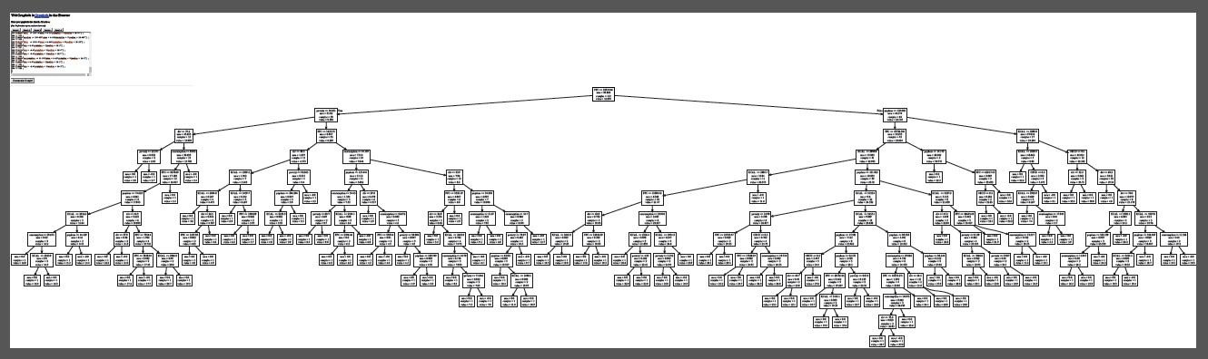
That is a really big tree! I had to zoom out to 9% on the PDF to visualize the entire structure. Notice how there is a root at the top and from there we have two decision nodes going in opposite directions. In general terms, the left side of the tree shows the countries with the lowest obesity prevalence. The countries with the highest obesity prevalence are in the right side of tree.
This is impossible to see from our image so let’s zoom in and focus on the top of the tree. In order to this we can open the “tree.dot” file and trim the tree manually before creating a new diagram. The output should look like this after a lot of re-arranging:
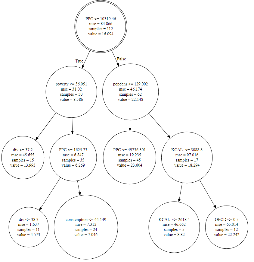
Let’s draw some observations from the top of our tree diagram:
- At the top of the tree we have our root, shown as a double circle node. The root of our tree is GDP per capita! Countries with the highest obesity levels have GDP per capita of 10,319 USD or more. Notice the value at the bottom of the node. That is the mean obesity prevalence we modelled in our logit.
- Let’s go left. The countries with below average obesity prevalence have poverty levels below 36%. The sample figure shows this constitutes 50 countries. From there, we can see different combinations of variables determining the leaves of the tree.
- Now we shift to the right, to the most obese countries. The decision node is population density. The most obese countries have a population density less than 129 people per square kilometer. From there, our tree seems to break off into middle to high-income countries (45 countries) and KCAL below 3088 (17 countries).
- The OECD does not appear to be a main decision node in our model, but there are 12 non-member countries with high obesity levels. This could explain the results we saw in the plots of the previous post.
Conclusions
There are so many conclusions we can draw from a simple tree diagram. This was clearly a great complement to the findings from the previous post. In the future, I hope to use bigger databases to apply the predictive power of this Machine Learning tool. For now, we have seen how to use it in Python and described the complex relationships between our variables. Thanks for stopping by!