Data Exploration and Visualization (PY)
Welcome to the fourth tutorial! We will try to recreate the graphs from the previous post using Python. First we will perform basic data exploration using pandas and NumPy.
Part 1: Basic Data Exploration
Once again, we will be using the “USA_data.csv”, which you can find in my Research repository, under the databases folder. This database compiles three variables from FRED for the years 1984-2014, expressed in billions USD: Real GDP, Savings, and Taxes. Make sure to properly specify your file path when loading the document:
#we will use pandas to read_csv function and create a data frame called d1:
import pandas as pd
d1 = pd.read_csv("USA_data.csv")
#to make sure we did this correctly we will view the first 3 elements of d1:
d1.head(3)
| Year | Real GDP | Savings | Taxes | |
|---|---|---|---|---|
| 0 | 1984 | 7285.0 | 884.5 | 425.7 |
| 1 | 1985 | 7593.8 | 884.0 | 460.7 |
| 2 | 1986 | 7860.5 | 867.8 | 479.8 |
We can see our four variables are as they should be.
#next we will perfom a summary of our dataframe using describe:
d1.describe()
| Year | Real GDP | Savings | Taxes | |
|---|---|---|---|---|
| count | 31.00 | 31.00 | 31.00 | 31.00 |
| mean | 1999.00 | 11774.59 | 1822.22 | 1072.29 |
| std | 9.09 | 2801.26 | 689.30 | 438.51 |
| min | 1984.00 | 7285.00 | 867.80 | 425.70 |
| 25% | 1991.50 | 9110.80 | 1155.25 | 653.20 |
| 50% | 1999.00 | 12065.90 | 1990.60 | 1077.70 |
| 75% | 2006.50 | 14516.25 | 2262.95 | 1371.00 |
| max | 2014.00 | 15982.30 | 3337.20 | 1995.00 |
Note how the output is basically the same as in R, showing basic statistics for our data.
#We will now find the mean of just Real GDP
#notice how the name of the variable goes in brackets after the dataframe d1:
(d1["Real GDP"]).mean()
11774.558064516128
#a similar logic applies to find the standard deviation of the savings:
(d1["Savings"]).std()
689.3044499574792
#now we will find the median for the taxes series:
(d1["Taxes"]).median()
1077.7
Now we will perform a simple aggregation to our dataframe. In this case, we want to add a variable that represents the savings rate as a proportion to the real GDP of the US:
#we will call the new variable we want to add Savings Rate
#we can see from the syntax this is just a vectorial operation:
d1["Savings rate"] = d1["Savings"]/d1["Real GDP"]
#checking if this new variable was added:
d1.head(3)
| Year | Real GDP | Savings | Taxes | Savings rate | |
|---|---|---|---|---|---|
| 0 | 1984 | 7285.0 | 884.5 | 425.7 | 0.121414 |
| 1 | 1985 | 7593.8 | 884.0 | 460.7 | 0.116411 |
| 2 | 1986 | 7860.5 | 867.8 | 479.8 | 0.110400 |
The new variable savings_rate has been added to our d1 dataframe!
#to finish we will find the mean savings proportion for this time period:
(d1["Savings rate"].mean())*100
14.983051715411833
Part 2: Simple plots using matplotlib
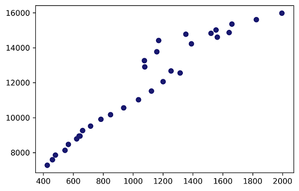
Now we will try to recreate basic scatterplots using matplotlib, which is the “most basic library for visualizing data graphically”. To start we will do a basic scatterplot between Taxes on the x-axis and Real GDP on the y-axis. Make sure that you have matplotlib installed before doing this:
#loading matplotlib
import matplotlib.pyplot as plt

#to shorten our sintax we will create x and y, with Taxes and Real GDP respectively:
x = d1["Taxes"]
y = d1["Real GDP"]

#now for the basic plot:
plt.plot(x, y, 'o', color='midnightblue')
#Note how we specified the "o" which stipulates dots on the plot.
#Additionally, the color name was added, which is one of my favorites for plots

#Since we want to export this plot to GitHub, we must save the plot as a png file:
plt.savefig('pyplot1.png', dpi=300, bbox_inches='tight')

#now we can add show() to see the plot:
plt.show()
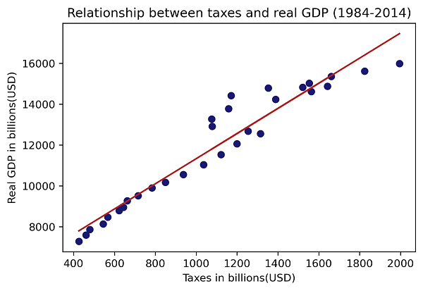
Suppose we now want to add axis labels and a title to our plot. Additionally, we want to add a linear regression line without using other libraries. A direct but clumsy solution would be to create the elements of the trendline using the NumPy polyfit funtion and then add these elements to our scatterplot:
#this is our base plot:
plt.plot(x, y, 'o', color='midnightblue')

#we import numpy:
import numpy as np

#we use the polyfit funtion, with the independent and dependent
#followed by the order of the polynomial:
m, b = np.polyfit(x, y, 1)

#now we add the trendline by altering our "y" variable:
plt.plot(x, m*x + b, color="firebrick")

#everything else is the same:
plt.xlabel('Taxes in billions(USD)')
plt.ylabel('Real GDP in billions(USD)')
plt.title('Relationship between taxes and real GDP (1984-2014)')

#saving the plot:
plt.savefig('pyplot2.png', dpi=300, bbox_inches='tight')
#adding show() to see the plot:
plt.show()
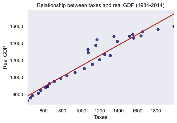
Part 3: Exploring plots with Seaborn
Python has a couple of libraries to choose from, but in this last section we will use Seaborn, an extension of Matplotlib. The syntax is similar to what we have been doing so far and the plots are quite elegant.
#note that for Seaborn we will use the original names of our variables in the syntax:
import seaborn as sns
sns.set()

#now we can use the Seaborn regplot function:
sns.set_style("dark")
sns.regplot(x="Taxes",
            y="Real GDP",
            ci=None,data=d1,
            color="midnightblue",line_kws={"color":"firebrick","lw":2})

#extra customization:
plt.title('Relationship between taxes and real GDP (1984-2014)')

#saving the plot:
plt.savefig('pyplot3.png', dpi=300, bbox_inches='tight')

#adding show() to see the plot:
plt.show()
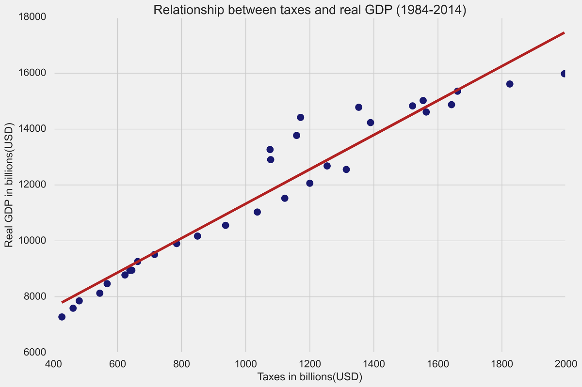
Lastly, we will try to use one of the built-in themes to do a “fancier” plot, which mimics FiveThirtyEight. The results so far have been more than acceptable, without needing too much customization. In this case we will redo the second plot but ask Python to use a given style:
#importing the style functionality:
import matplotlib.style as style

#we must ask Python to use this FiveThirtyEight style theme for our plot:
style.use('fivethirtyeight')

#this is our base plot:
plt.plot(x, y, 'o', color='midnightblue')

#we use the polyfit funtion, with the independent and dependent
m, b = np.polyfit(x, y, 1)

#now we add the trendline by altering our "y" variable
plt.plot(x, m*x + b, color="firebrick")

#everything else is the same:
plt.xlabel('Taxes in billions(USD)')
plt.ylabel('Real GDP in billions(USD)')
plt.title('Relationship between taxes and real GDP (1984-2014)')

#saving our plot:
plt.savefig('pyplot4.png', dpi=300, bbox_inches='tight')

#show the plot:
plt.show()
If you did everything correctly, your plot should look like the one at the top of the page. Clearly, I am being a bit lazy by not diving deeper into more customization, but this is my first time using any of these plots, so not a bad way to start!
Conclusions
In this tutorial we have seen how to use Python to perform basic data exploration for a .csv file. We also took what was once a simple scatterplot and turned it into a much more professional plot. This is only an introduction to visualization in Python and there are plenty of resources available online to dive into. Thanks for coming along!