Data Exploration and Visualization (R)
In this short tutorial we will perform basic data exploration and more complex visualization techniques using ggplot2. The objective is to showcase R’s flexibility for presenting customizable plots.
Part 1: Basic Data Exploration
For this exercise, we will be using a simple file called “USA_data.csv”. This database compiles three variables for the years 1984-2014, espressed in billions USD: Real GDP, Savings, and Taxes. The data was collected from FRED and was used in a SEM model I performed a few years ago. The first step is to download the data from my Research repository. The link is on the github icon at the bottom and the folder is called databases. To load it to R, make sure the folder you place your downloaded file matches your working directory:
#just checking our current directory:
getwd()
## [1] "/...Documents/Research with R and Python"
#it matches where the file is stored so we can load the file and call it d1:
d1 <- read.csv("USA_data.csv")
#for a basic summary of our data we can simply do:
summary(d1)
##     ï..Year        Real.GDP        Savings           Taxes
##  Min.   :1984   Min.   : 7285   Min.   : 867.8   Min.   : 425.7
##  1st Qu.:1992   1st Qu.: 9111   1st Qu.:1155.2   1st Qu.: 653.2
##  Median :1999   Median :12066   Median :1990.6   Median :1077.7
##  Mean   :1999   Mean   :11775   Mean   :1822.2   Mean   :1072.3
##  3rd Qu.:2006   3rd Qu.:14516   3rd Qu.:2262.9   3rd Qu.:1371.0
##  Max.   :2014   Max.   :15982   Max.   :3337.2   Max.   :1995.0
From the summary we can see basic statistics for our four variables. One minor issue is that the Year variable was not coded correctly, so we can adjust this using base functions by doing:
#first we can check the column names for our data:
colnames(d1)
## [1] "ï..Year" "Real.GDP" "Savings" "Taxes"
#Rename the column where the name is "1..Year":
names(d1)[names(d1) == "ï..Year"] <- "Year"
#checking if it worked:
colnames(d1)
## [1] "Year" "Real.GDP" "Savings" "Taxes"
Now we can conduct some basic descriptive statistics for our data:
#Suppose we wanted the mean of just the Real GDP, we use $:
mean(d1$Real.GDP)
## [1] 11774.56
#same logic if we wanted the standard deviation of the Savings:
sd(d1$Savings)
## [1] 689.3044
#conversely we can attach our data, which makes accessing each variable easier:
attach(d1)
#this is not recommended if you are working with multiple datasets!

#to find the median in the taxes, i.e. the 0.5 quantile:
median(Taxes)
## [1] 1077.7
Since every variable is being interpreted as a numeric vector, we can perform similar operations as in the previous tutorial. Suppose we wanted to create the yearly savings as a proportion of real GDP:
#we can add the new variable to our data in one go doing:
d1$savings_rate <- Savings/Real.GDP
#verifying that we have another variable:
colnames(d1)
## [1] "Year"         "Real.GDP"     "Savings"      "Taxes"
## [5] "savings_rate"
#checking the national mean savings proportion for the period:
mean(d1$savings_rate)*100
## [1] 14.98305
#the savings seems to be about 15% of the real GDP for this period
Part 2: Simple Built-in Plots
Suppose we wanted to explore the relationship between Real GDP and taxes in the United States. In order to do this, we can perform the correlation between both variables and also make a scatter plot to visualize this relationship:
#for a simple correlation test we can perform:
cor.test(Real.GDP, Taxes)
##
##  Pearson's product-moment correlation
##
## data:  Real.GDP and Taxes
## t = 19.229, df = 29, p-value < 2.2e-16
## alternative hypothesis: true correlation is not equal to 0
## 95 percent confidence interval:
##  0.9238369 0.9821652
## sample estimates:
##       cor
## 0.9629522
#We reject the null, there is positive correlation between both variables
#This clearly makes sense from a national accounts perspective
Now we can do a basic plot, recalling that our database is still “attached”:
#we can use the built-in plot function to generate the most basic scatterplot:
plot(Taxes, Real.GDP)
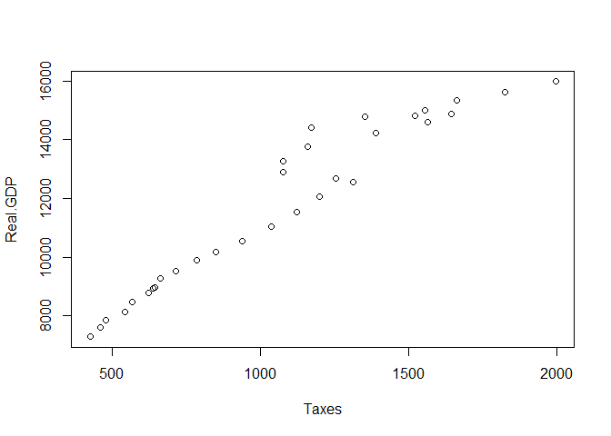
Note how the order of the imput matters. Taxes were added automatically to the x-axis and Real.GDP is interpreted in the y axes. Clearly this is a very simple plot, but we can customize it in the following way:
#just performing an initial linear regression of taxes explaining GDP:
reg <- lm(d1$Real.GDP ~ d1$Taxes)

#changing the point shape to filled circles (pch = 19) and adding a title:
plot(Taxes, Real.GDP, main = "Relationship between taxes and real GDP in the US",
     xlab = "Taxes in billions USD", ylab = "Real GDP in billions USD",
     pch = 19, col="midnightblue")

#adding our trend line to the plot:
abline(reg, col = "firebrick", lwd=2)
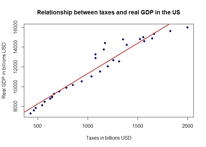
That is a nicer plot. Note that we also specified the colors for the points (midnightblue) and for the line (firebrick). This is completely optional but I always like how the combination works. Now we will finish with a more robust approach using ggplot.
Part 3: A More Robust Approach with ggplot2
This is by no means intended to be a tutorial on ggplot2, that in itself is an online course. Here is a nice introduction to the ggplot syntax. Instead, I will merely look to enhance the plot we have worked on:
#we call for the package using library(), make sure it is installed first:
library(ggplot2)
#the base code for a ggplot2 scatter plot would be:
ggplot(d1,aes(x=Taxes,y=Real.GDP))+geom_point(col="midnightblue")
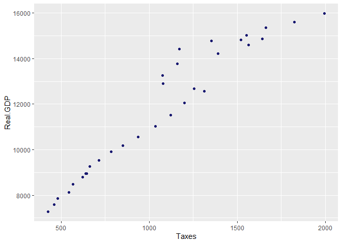
Note that we specify the “geom” we want to use for our plot, in this case points. A nice thing about ggplot2 is that we can save our plots as objects and configure them as we go along:
#first we will save the plot above and call it p1:
p1 <- ggplot(d1,aes(x=Taxes,y=Real.GDP))+geom_point(col="midnightblue", size=1.5)
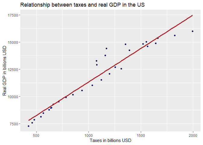
#now we will customize this plot and add our trendline along with other nice elements:
p1 + geom_smooth(method = lm,se=FALSE, col="firebrick", size=1.2)+
ylab(c("Real GDP in billions USD"))+xlab(c("Taxes in billions USD"))+
ggtitle(c("Relationship between taxes and real GDP in the US"))
That is a nicer plot! Still, we can do even more using the package “ggthemes” which allows for even more customization. There are also built-in themes for lazy people like me, which “reflect” other themes. Let’s try “The Economist” theme, since we are dealing with economic data:
library(ggthemes)
#we will create another plot object with minor updates:
p2 <- p1 + geom_smooth(method = lm,se=FALSE, col="firebrick", size=1.2)+
ylab(c("Real GDP in billions(USD)"))+ xlab(c("Taxes in billions(USD)"))+
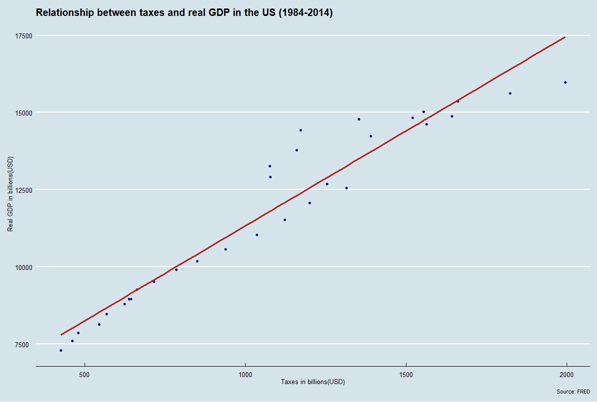
labs(title="Relationship between taxes and real GDP in the US (1984-2014)", caption = "Source: FRED")
#the syntax is similar so we just call for our second plot and add the theme:
p2+theme_economist()
That looks like the real deal! If you did everything correctly the graph should be the same as the one at the top of the page.
Conclusions
We have seen very basic data exploration in R. From the plot above we can see how much ggplot2 offers to transform an ordinary scatterplot into quite an impressive graph. This is merely sratching the surface. In the next post I will replicate this exercise using Python!